Why the Krodox dashboard is built on Flux
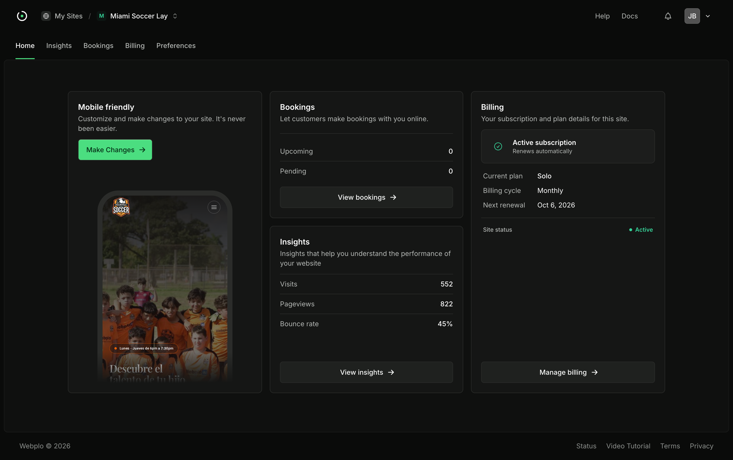
Everything a Krodox customer sees after signing in (the dashboard, site settings, bookings, billing, the account pages) is built with Flux, the component library made by the Livewire team. So is the operations console we use to run the platform.
That is about 170 Blade views, 35 different Flux components and, at last count, more than 270 buttons. This is why we did not build them ourselves, and what the decision has cost.
The question was never "which design system"
Krodox is a Laravel 13 application on Livewire 4. The interface is rendered on the server and made interactive by Livewire and Alpine. Whatever we used for components had to be Blade components, or we would be running a second front-end stack next to the first one.
That left two real options: write our own component set, or use Flux.
Writing our own looks cheap at the start. A button is a few classes. A text input is a few more. The cost arrives later, in the components nobody wants to write twice: a modal that traps focus and hands it back when it closes, a dropdown you can drive from the keyboard, a time picker, a select that works on a phone, a switch a screen reader can announce. Each of those is a small project, and each one is behaviour our customers would notice only when it was broken.
A small business owner changing their opening hours at eleven at night should not be the person who discovers that our home-made time picker does not close when they press Escape.
What using it looks like
This is the booking alerts row from the email preferences page, trimmed to what matters:
<x-home.row
    icon="bell"
    :title="__('messages.settings.email_preferences.booking_notifications.label')"
    :meta="__('messages.settings.email_preferences.booking_notifications.description')"
>
    <x-slot:trailing>
        <flux:switch
            wire:model.live="bookingNotificationsEnabled"
            :aria-label="__('messages.settings.email_preferences.booking_notifications.label')"
        />
    </x-slot:trailing>
</x-home.row>
On screen the row reads "Booking alerts", with "An alert for every new booking" underneath. <x-home.row> is our own component. It puts the icon, title and description on the left and whatever you slot into trailing on the right. <flux:switch> is the whole switch: the markup, the states, the keyboard handling, the accessibility attributes, and the binding to the Livewire property through wire:model.live, which saves the change as the owner flips it. No JavaScript is written for it, and nothing about it is specific to this page.
The same pattern holds for a text field, a segmented control or a select. Put a Flux control inside a row and the page stays consistent without anyone having to remember a rule.
Modals are where it pays for itself
Changing a site's address is a risky change, so it happens in a modal with two steps. In the first, below, the owner types the new address and sees whether it is available as they type. In the second, the modal shows the old address crossed out next to the new one and says that visitors to the old address will be redirected for 30 days. Nothing changes until they confirm.
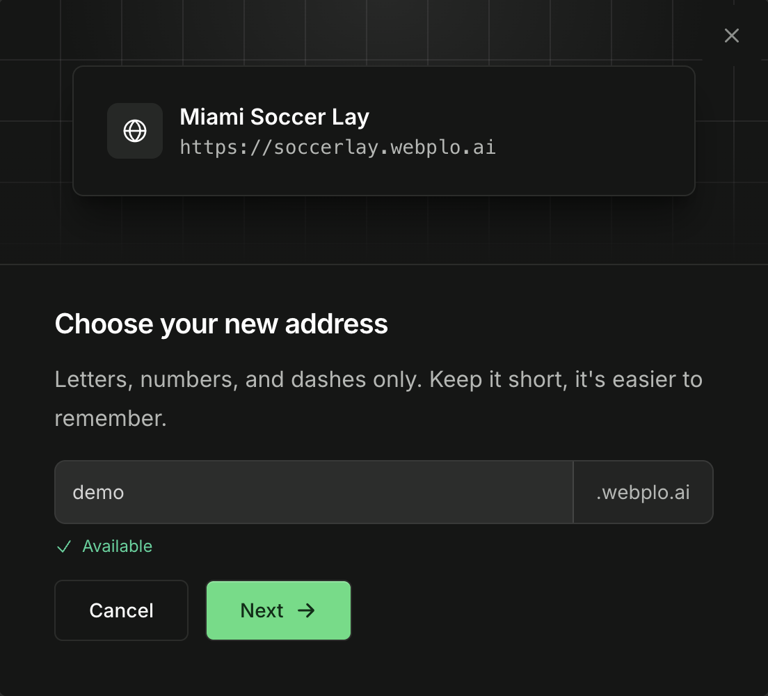
We wrote the content of those two steps. Flux handles everything around it: opening and closing, focus, the Escape key, the close button, the backdrop, and a second step inside the same dialog. We use dozens of modals across the app, and not one of them has needed us to debug that behaviour ourselves.
One accent, one variable
Flux paints its switches, checkboxes, radios, links and primary buttons with a single CSS variable, --color-accent. We point that variable at our own token, and the token is the only place the dashboard's accent is defined:
--color-accent:            var(--app-accent);
--color-accent-foreground: var(--app-accent-fg);
Under the ink-on-paper look of the dashboard that accent is near-black in light mode and near-white in dark mode, with a matching text colour on top and a hover shade. Nothing in a view knows what the accent is. Earlier versions let each account pick one of five colour themes; we removed that, and because every view only ever referred to the token, removing it meant deleting the theme overrides and changing no view. That is the practical argument for routing a library's colour through one variable of your own.
Theme it, do not fork it
Flux lets you publish any component into your own project and edit it. We have been careful with that. Out of 35 components in use, we have published two (the sidebar navigation list and the toast), plus a set of our own icons that Flux renders alongside its built-in ones. Everything else is styled through tokens.
The reason is upgrades. A component you have published is a component you now maintain. Anything left alone gets its fixes and accessibility improvements with a composer update. When a new Flux release lands, we read the changelog, run the test suite and ship it.
What it costs
It would be dishonest to present this as free.
It is a paid licence. The components we rely on most (the time picker, the richer selects) are in Flux Pro. For a company building one product that is cheap compared with the engineering time it replaces, but it is a line on the budget.
It ties us to Livewire. Flux is Blade and Livewire. If we ever wanted a React front end, the components would not come with us. We are comfortable with that because the whole platform is built on the Laravel stack, but it is a real lock-in.
It has opinions. Flux has its own spacing, sizes and defaults, and occasionally our design wants something different. Most of the time a token is enough. When it is not, we lose a little time working with the library instead of around it.
Edges exist. The carousel component in one release shipped a class that our CSS build could not parse, which produced a warning on every build. We use the carousel (on the portfolio section of the site list and in the screenshot strips on our blog), so we keep that one stub out of the CSS scan and style the parts we need, such as the indicator dots, ourselves. Small, but the kind of thing you inherit with any dependency.
Would we choose it again
Yes. The test we apply to a dependency is whether it lets a small team spend its time on the product instead of on infrastructure the customer never sees. For Krodox, that is the booking flow, the site editor and a launch that takes about a minute and a half. A modal that closes properly is not where we want to be clever.
If you are building on Laravel and Livewire, Flux is the default we would recommend. If you are not on Livewire, it is not for you, and no amount of theming changes that.